Legend charts are small charts that are added to the map, usually in addition to legends.
Usage
tm_chart_histogram(
  breaks,
  plot.axis.x,
  plot.axis.y,
  extra.ggplot2,
  position,
  group_id,
  width,
  height,
  stack,
  z,
  ...
)

tm_chart_bar(
  plot.axis.x,
  plot.axis.y,
  extra.ggplot2,
  position,
  group_id,
  width,
  height,
  stack,
  z,
  ...
)

tm_chart_donut(position, group_id, width, height, stack, z, ...)

tm_chart_violin(position, group_id, width, height, stack, z, ...)

tm_chart_box(position, group_id, width, height, stack, z, ...)

tm_chart_none()

tm_chart_heatmap(position, group_id, width, height, stack, z, ...)
Arguments
- breaks
The breaks of the bins (for histograms)
- plot.axis.x, plot.axis.y
Should the x axis and y axis be plot?
- extra.ggplot2
Extra ggplot2 code
- position
The position specification of the component: an object created with
tm_pos_in()ortm_pos_out(). Or, as a shortcut, a vector of two values, specifying the x and y coordinates. The first is"left","center"or"right"(or upper case, meaning tighter to the map frame), the second"top","center"or"bottom". Numeric values are also supported, where 0, 0 means left bottom and 1, 1 right top. See also vignette: Positioning of components. In case multiple components should be combined (stacked), usegroup_idand specifycomponentintm_components().- group_id
Component group id name. All components (e.g. legends, titles, etc) with the same
group_idwill be grouped. The specifications of how they are placed (e.g. stacking, margins etc.) are determined intm_components()where its argumentidshould correspond togroup_id.- width, height
width and height of the component.
- stack
stack with other map components, either
"vertical"or"horizontal".- z
z index, e.g. the place of the component relative to the other componets
- ...
passed on to
tm_title()
Details
Note that these charts are different from charts drawn inside the map. Those are called glyphs (to be implemented).
Examples
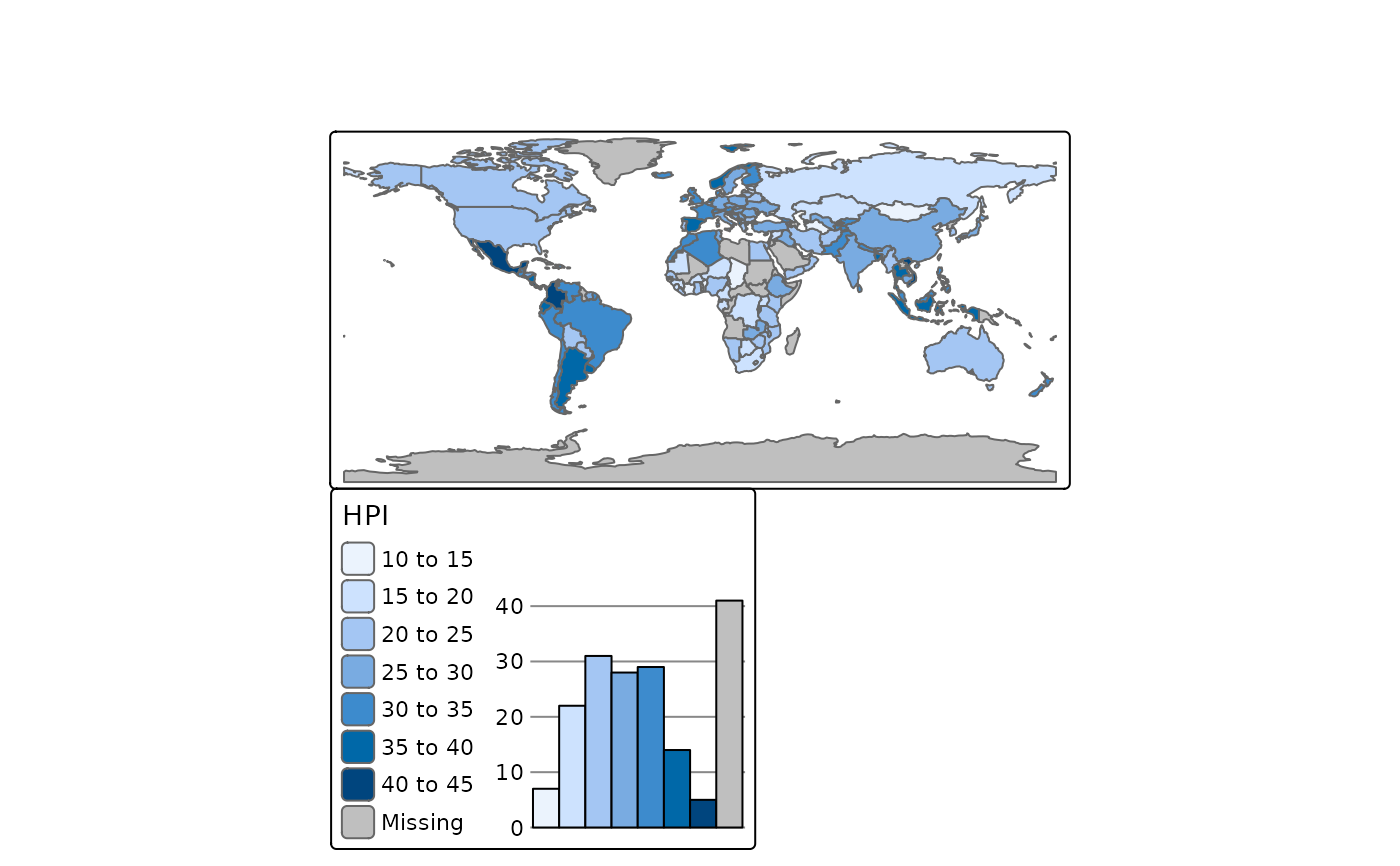
tm_shape(World) +
  tm_polygons("HPI",
    fill.scale = tm_scale_intervals(),
    fill.chart = tm_chart_histogram())